

The Power of Visuals in Healthcare Communication
In today’s healthcare environment, data visualization plays a crucial role. It turns complicated medical information into clear, easy to understand visuals that help everyone from clinicians to patients. People naturally absorb images faster than long blocks of text and these visuals make communication smoother and help important insights stand out a lot more.
Visual representations, such as charts, graphs, and infographics, provide a quick, intuitive grasp of medical data. This clarity is vital in a field where time is of the essence and precision is paramount. For instance, a well-designed chart can immediately convey patient trends, lab results, and demographic data that might take pages of text to explain. This immediacy not only saves time but also minimizes the risk of misinterpretation.
Moreover, visual data aids in elucidating complex concepts to patients. A clear graph or an animated model can demystify medical conditions, making them more tangible and less intimidating. This approach not only fosters patient understanding but also empowers them to participate actively in their healthcare journey.
Thus, as healthcare continues to evolve, the role of data visualization becomes increasingly central. By transforming data into visual narratives, healthcare professionals can ensure that the information is not just available but accessible and actionable for all involved.
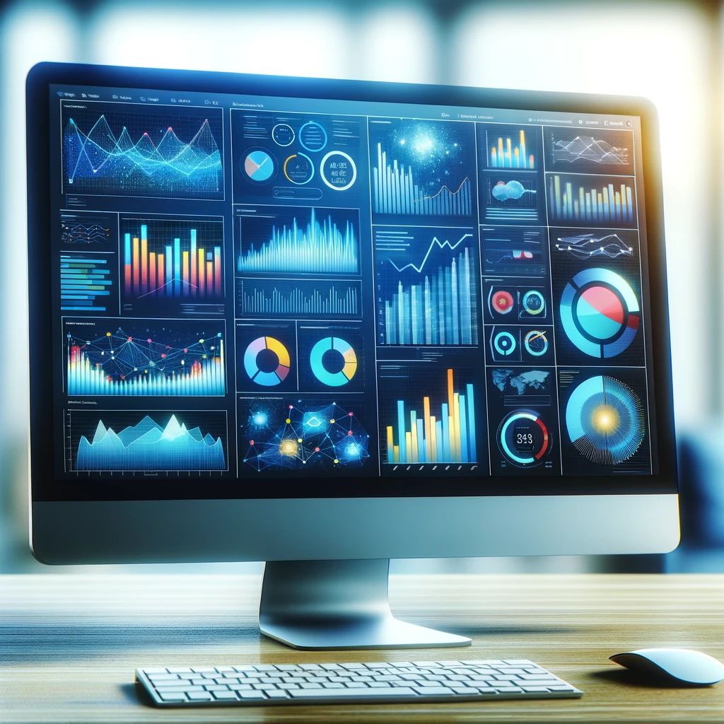
Key Data Visualization Tools in Healthcare Analytics
Having proficiency in tools like Tableau and Power BI is increasingly crucial. These platforms stand out for their robust functionalities and user-friendly interfaces, making complex data analysis more accessible and insightful.
Tableau excels in creating interactive, visually engaging reports. Its ability to handle large datasets effortlessly is a significant boon for healthcare analysts. Tableau offers real-time data updates, a feature essential for tracking patient outcomes and healthcare trends. Its drag-and-drop interface allows analysts to create detailed visualizations without needing extensive coding knowledge. This ease of use makes Tableau a preferred choice for healthcare institutions aiming to democratize data access across their teams.
Power BI, Microsoft’s offering in this space, integrates seamlessly with other Microsoft products, a key advantage for many healthcare organizations already using this ecosystem. Power BI’s strength lies in its advanced data modeling capabilities and extensive visualization options. It enables analysts to transform raw healthcare data into actionable insights, aiding in better decision-making. Power BI also offers robust security features, ensuring sensitive healthcare data remains protected, an essential aspect in this field.
Both Tableau and Power BI support a data-driven culture in healthcare organizations. They empower professionals to visualize and analyze data effectively, leading to improved patient care and operational efficiencies. Mastery of these tools is becoming a valuable skill for healthcare data analysts. It equips them to turn vast amounts of healthcare data into coherent narratives that drive strategic decisions.
Improving Clinical Decision-Making with Data Visualization
Data visualization is revolutionizing clinical decision-making in healthcare. By translating vast amounts of medical data into graphical formats, it offers healthcare professionals a more nuanced, comprehensive view of patient information. This enhanced perspective is crucial in diagnosing, monitoring, and treating patients with greater accuracy and efficiency.
Case studies in various medical fields underscore the transformative impact of data visualization. For example, oncologists use trend graphs to monitor tumor growth or reduction in response to treatments, enabling timely adjustments to therapy plans. Similarly, in epidemiology, maps and heat charts track disease outbreaks, guiding public health interventions.
Another significant advantage is in diagnosing complex cases. By visually representing a patient’s symptoms, test results, and medical history, clinicians can identify patterns and correlations that might be missed in traditional data formats. This method supports a more holistic and precise approach to diagnosis.
Data visualization also plays a critical role in patient monitoring. Interactive dashboards that update in real-time provide a comprehensive view of a patient’s status, from vital signs to medication adherence. This real-time monitoring is vital in critical care and chronic disease management, where timely interventions can significantly alter patient outcomes.
In essence, data visualization is not just a tool for data representation; it is a catalyst for smarter, more informed clinical decisions. As healthcare data continues to grow in volume and complexity, the ability to distill this information visually will be instrumental in advancing patient care.
Enhancing Patient Understanding and Engagement
Data visualization revolutionizes patient education, turning complex health information into accessible, engaging visuals. This approach significantly boosts patient comprehension and involvement in their healthcare journey. Through charts, graphs, and interactive models, patients gain a clearer picture of their health status, treatment pathways, and recovery progress.
For instance, an intuitive infographic explaining cardiovascular health can dramatically simplify a patient’s grasp of their heart condition. Similarly, visual progress trackers for diabetes management enable patients to see the direct impact of lifestyle changes on their blood sugar levels. Such visual tools not only educate but also motivate patients, fostering a sense of control and partnership in managing their health.
Moreover, interactive data visualizations in patient portals have become a cornerstone in patient-centered care. These platforms allow patients to track their health metrics, visualize treatment effects, and set personal health goals. This interactive element not only engages but also empowers patients, leading to improved adherence to treatment plans and better health outcomes.
The use of visual aids in patient education bridges the gap between complex medical data and patient understanding. By simplifying and visualizing health information, healthcare providers enhance patient engagement, resulting in more informed, confident, and proactive patients.
Data Visualization in Public Health and Epidemiology
In public health and epidemiology, data visualization serves as a tool for monitoring health trends, tracking disease outbreaks, and shaping health policies. By transforming raw data into clear, impactful visuals, public health professionals can communicate complex epidemiological information to a diverse audience, from policymakers to the general public.
Take, for example, the visualization of COVID-19 trends. Interactive maps and graphs provided real-time insights into infection rates, hotspots, and vaccination coverage, playing a crucial role in public awareness and response strategies. Similarly, visualizations depicting the prevalence of chronic diseases help identify at-risk populations and target preventive measures effectively.
Data visualizations also facilitate the exploration of health disparities. Maps highlighting variations in health outcomes across different regions can illuminate areas needing targeted interventions. This visual approach not only informs public health initiatives but also drives policy changes by providing compelling evidence of the need for resource allocation.
Furthermore, in epidemiological research, visualizations assist in identifying patterns and correlations in health data, uncovering potential risk factors, and guiding future research directions. The power of data visualization in public health lies in its ability to convey complex data in a format that is both accessible and actionable, ultimately contributing to informed decision-making and better health outcomes for communities.
Challenges and Ethical Considerations
Misleading visuals can lead to incorrect interpretations, impacting patient care decisions. It’s crucial to maintain a balance between simplicity and comprehensive data representation. This approach ensures visualizations are both accessible and precise.
Privacy concerns are huge. With sensitive health data at stake, adhering to regulations like HIPAA in the US is non-negotiable. Visualizations must anonymize patient data, safeguarding against unauthorized identification. This practice upholds patient confidentiality while allowing valuable insights to be gleaned.
Ethical considerations extend to presentation styles. Visuals should avoid biases that might influence patient or provider perceptions. They must present data objectively, yet sensitively, particularly in scenarios involving prognoses or treatment outcomes. This approach fosters trust and maintains the integrity of healthcare communication.
The potential for misinterpretation is another significant challenge. Complex data can be oversimplified or taken out of context. Ensuring healthcare professionals and patients understand the limitations and context of visual data is essential. Education on interpreting these visuals can mitigate risks of misinterpretation.
Creating effective healthcare visualizations demands a careful balance. It requires accuracy, privacy adherence, ethical sensitivity, and clarity to prevent misinterpretation. These practices safeguard both patient interests and the integrity of healthcare decisions.
The Future of Data Visualization in Healthcare
Emerging technologies, particularly AI and machine learning, are set to redefine how health data is visualized. These advancements promise more intuitive, dynamic visualizations, enhancing decision-making processes.
AI’s ability to analyze vast datasets can unveil patterns invisible to the human eye. This capability will lead to more nuanced visualizations, offering deeper insights into patient health trends and treatment efficacies. Machine learning algorithms can tailor these visualizations to individual patient profiles, enhancing personalized medicine.
Real-time data visualization is another frontier. Technologies like wearable health devices feed continuous data streams, enabling real-time monitoring of patient health. Visualizations of these data can aid in immediate decision-making, potentially improving patient outcomes in acute care scenarios.
The integration of virtual and augmented reality in data visualization also holds potential. These technologies can transform abstract data into immersive, interactive experiences. Such advancements could revolutionize patient education, making complex health information more tangible and understandable.
However, these advancements come with challenges. Ensuring accuracy and privacy in AI-driven visualizations will be paramount. Additionally, the healthcare industry must keep pace with these technologies, ensuring professionals are equipped to interpret and utilize advanced visualizations effectively.
The future of healthcare data visualization is marked by technological innovation. These advancements promise enhanced decision-making, personalized patient care, and more engaging ways to understand health data. However, they also demand careful navigation of accuracy, privacy, and educational challenges to realize their full potential.
I like this website so much, saved to my bookmarks.